
Art has always been present in advertising, from packaging to graphic design and visual branding – aesthetics have always attracted consumers.
Alphonse Mucha (one of my favourite artists) was a most influential figure of the Art Nouveau period, at its height between 1890 and 1910. This movement had its roots in Britain and spawned likely the most decorative and flamboyant phase of traditional advertisement and promotions. His advertising style triumphed during his time, and left a lasting impact in the art world.
His style began its ascent into popularity at the end of 1894; his career took a volta when he began to work for Sarah Bernhardt, a famous French stage actress. Bernhardt decided to have a poster made to advertise the prolongation of one of her successful plays, Gismonda. One of the innovative design features of the poster was the halo-like arch behind the head which focused her face; this feature appeared in all of his future theater posters. The poster featured soft pastel colors, unlike the typical brightly-colored posters of the time.
The top of the poster with the title was richly composed and ornamented, balancing the bottom where the essential information was given in the shortest possible form – just the name of the theatre – much like the simple and intelligent design we often see today. In addition to posters, he designed sets, costumes, and jewelry for Bernhardt, highlighting how one successful venture can spawn many opportunities to apply the same branding methods in other related media types, if the style is distinct and universally attractive enough.
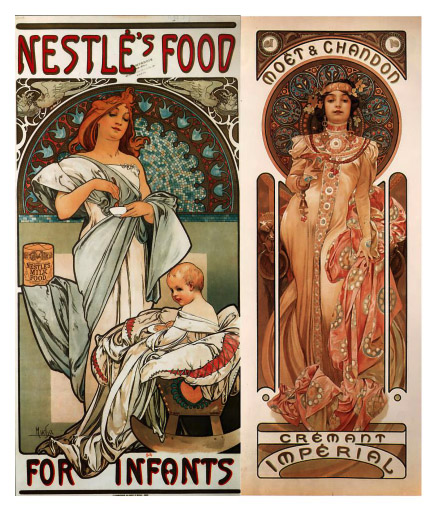
 After the success of the Bernhardt posters, Mucha went on to produce many more advertising posters for iconic brands. He designed posters for JOB cigarette papers, Nestlé baby food, Idéal Chocolate and Moët-Chandon champagne, among others.
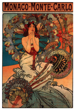
 The main subject of these pieces were beautiful women in elaborate surroundings with hair, clothes and flora usually curling in enticing, arabesque forms. An example is his poster for the railway line between Paris and Monaco-Monte-Carlo (1897) which did not show a train or any specific scenery from the mentioned locations at all.
This design and stylistic choice may have been so effective because of the contrary nature to what it advertised: instead of the dark, hard steel of a train and industrial coldness of a railway, it presented a beautiful young woman in wonder, surrounded by the organic swirling shapes of floral motifs that suggested the turning motions and wheels of a train.
This method of promoting goods was fully centered in visual pleasure and indirectly implying the external benefits of the product via imagery, like the impressive sights that the train ride might provide, implied by the woman’s awe at her settings.
The main subject of these pieces were beautiful women in elaborate surroundings with hair, clothes and flora usually curling in enticing, arabesque forms. An example is his poster for the railway line between Paris and Monaco-Monte-Carlo (1897) which did not show a train or any specific scenery from the mentioned locations at all.
This design and stylistic choice may have been so effective because of the contrary nature to what it advertised: instead of the dark, hard steel of a train and industrial coldness of a railway, it presented a beautiful young woman in wonder, surrounded by the organic swirling shapes of floral motifs that suggested the turning motions and wheels of a train.
This method of promoting goods was fully centered in visual pleasure and indirectly implying the external benefits of the product via imagery, like the impressive sights that the train ride might provide, implied by the woman’s awe at her settings.
 This distinct and indulgent style of Mucha was evidently a massive sensation and driving force of the Art Nouveau movement, his work and art style becoming the movement’s most recognised – which he actually resented.
“What is it, Art Nouveau?” he asked. “…Art can never be new.”
Mucha’s most famous pieces were none that he cared for, and he longed for his more personal work to be lauded to the same degree. Although unfortunate, it brings to mind the pitfalls of branding and the privilege of being taken seriously.
Popular brands are all ridiculed yet consistently successful and internationally known, such as Starbucks, whose customers have been attributed to having a pretentious and obnoxious personality and McDonalds, which is widely associated with obesity – both are often used in insults. Although these attitudes do not make much of a dent in the businesses’ success, poor branding and advertising choices definitely damage start-ups and lesser known companies/products.
Ads are certainly more eye-catching when embellished with grand swirls and shapes, pretty colours and flowery long-haired women, but how effective would they be now? It is possible Mucha’s poster style went out of fashion because they all looked too similar in theme. Originality is key in design but sometimes consistency can end up getting lost in the wave of new trends of the modern age.
Modern advertising in physical media mostly consists of photography and vector graphics, correlating with the rise of technology, but “retro” methods of merchandising prove to be popular. Whether it stems from nostalgia marketing or trends popular with younger people, art and advertising from the past are just as relevant and deserving of a revisit today.
This distinct and indulgent style of Mucha was evidently a massive sensation and driving force of the Art Nouveau movement, his work and art style becoming the movement’s most recognised – which he actually resented.
“What is it, Art Nouveau?” he asked. “…Art can never be new.”
Mucha’s most famous pieces were none that he cared for, and he longed for his more personal work to be lauded to the same degree. Although unfortunate, it brings to mind the pitfalls of branding and the privilege of being taken seriously.
Popular brands are all ridiculed yet consistently successful and internationally known, such as Starbucks, whose customers have been attributed to having a pretentious and obnoxious personality and McDonalds, which is widely associated with obesity – both are often used in insults. Although these attitudes do not make much of a dent in the businesses’ success, poor branding and advertising choices definitely damage start-ups and lesser known companies/products.
Ads are certainly more eye-catching when embellished with grand swirls and shapes, pretty colours and flowery long-haired women, but how effective would they be now? It is possible Mucha’s poster style went out of fashion because they all looked too similar in theme. Originality is key in design but sometimes consistency can end up getting lost in the wave of new trends of the modern age.
Modern advertising in physical media mostly consists of photography and vector graphics, correlating with the rise of technology, but “retro” methods of merchandising prove to be popular. Whether it stems from nostalgia marketing or trends popular with younger people, art and advertising from the past are just as relevant and deserving of a revisit today.